Recently, during my visits to various online flea markets, I bought a batch of old electronic junk for just a few euros, and there was also this very stylish controller with an Atari-type connector, making it compatible with my Commodore 64 and VIC 20 as well.
It’s in very good cosmetic condition. The plastic probably wasn’t yellowish when it was new 40 years ago, but I’m not one of those obsessed with retrobrighting, so as far as I’m concerned, it’s perfect as it is.
I have a soft spot for electronic devices with transparent plastic cases; in this particular case, you can see the LEDs inside lighting up every time a button is pressed.
It’s not a necessary feature for playing games, but visually, I must say it looks pretty cool. Very flashy!

I wasn't familiar with the last mode. Here's the only information I found about it online from an old Italian magazine (Full text of K-Kappa magazine issue 44):
In decathlon mode, while the top green button is pressed, the joystick reacts as if it's going right, and when it's released, it goes left (very practical, but who still plays Decathlon?)Unfortunately, this switch doesn't lock into position, which makes it very inconvenient if you want to activate the central auto-fire position during a game, since you have to set the lever exactly in the middle, and the function won't activate if it's just a little bit off-center.
In my opinion, it would have been better to have the decathlon mode in the center. This way, it would have been much simpler to switch from normal to auto-fire mode.
If I wanted to, I could make a small modification by swapping a couple of wires, but I think I'll leave the controller as it is. I've always seen the auto-fire option as a bit like cheating!
Once opened, I immediately realize the first problem: one of the two green wires has detached from the PCB (the one towards the bottom).

I desolder all the wires and finally get access to the other side.


I checked them all with the multimeter (in diode test or continuity test mode), and they work perfectly.
I grab my desoldering gun and proceed with the replacement!


The capacitor is 100uF / 16V. According to the table on the ESR meter itself, it should have a maximum ESR of 0.7 ohms.


With the multimeter (forgive me, but I forgot to take a photo), I also checked its capacitance, and it was around 90uF, reasonably within tolerance.
So, the capacitor is okay!
I should have done this after resoldering the wires; in fact, I cleaned it again afterwards.


The second top button, however, uses a different mechanism.
To do this, just put a drop of alcohol on the switch, a small piece of paper between the contacts, close the contact, and slide the paper to wipe away any traces of dirt.


In the worst case, they're rusty, but maybe they're just very dirty.
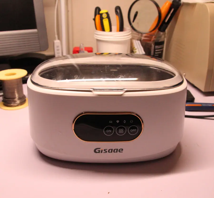
I'll try cleaning them with the ultrasonic cleaner.
You'll see it often on these pages.

Along with the water, I added a drop of dish soap.


Much better than before!

For this reason, once I assembled the circuit in the case, I realized that the plastic parts of the big red buttons (the action buttons) are keeping the switches pressed down, making them unusable.
However, there's no problem with the switches corresponding to the control lever.


In fact, some commands don't work.
Before proceeding, I need to note which wires correspond to the individual pins of the connector.
It's a very tedious but necessary job.
To do this, I took a small piece of metal wire (one of those leftover when soldering resistors), connected it to the various pins of the connector, and one by one I checked with the tester, in continuity test mode, which wire it corresponded to on the PCB, noting everything down on a post-it.


These cost very little on AliExpress.


Another tedious job, but someone has to do it.

Useful for horizontal scrolling shooters, such as Defender!
Conclusions
In my opinion, this is a well-made, solid controller with good quality plastic, and it definitely deserved a second life.It's a shame about the not-very-useful switch for selecting the game mode, but I'll live with it.
It also seems to be quite rare, given the scarcity of information found online.
I think I did a good job with this restoration, and I certainly enjoyed doing it.
Let's hope the new switches last over time.
CSS Trick: animated background on the logo
For this blog, I used the Hugo framework with the Risotto theme; I enjoy the minimalist style and this combination particularly convinced me, being simple and without too many frills.
I made some changes to the theme to adapt it to my needs, and the one I would like to talk about in this post concerns the animation of the logo background.
To achieve the rotating gradient effect that is currently visible, I initially experimented with a bit of JavaScript, like this:
document.addEventListener("DOMContentLoaded", () => {
const DEG_STEP = 2.8125 // equivalent to 360 / 128;
const INTERVAL = 62.5 // equivalent to 8000 / 128
let deg = 42;
let logo = document.querySelector(".page__logo-inner");
setInterval(() => {
deg += DEG_STEP;
deg %= 360;
logo.style["background-image"] = `linear-gradient(${deg}deg, rgb(247, 115, 241), rgb(16, 180, 215))`;
}, INTERVAL)
});
Upon page load, the setInterval function starts, modifying the background-image style every 62.5 milliseconds to effectively rotate the linear-gradient.
The loop lasts 8 seconds. In 8 seconds, 128 frames are drawn, and at each frame the rotation advances by 2.8125 degrees.
Everything worked perfectly, but I noticed a problem: when I opened the developer tools, the CPU usage spiked.
This happened because in the Elements tab of the developer tools, the page’s DOM is visible, with the inline styles clearly visible.
The style of the tag with the class .page__logo-inner, in fact, is constantly updated, and the browser consumes CPU to display the changes, which, as mentioned before, occur every 62.5 milliseconds.
Probably for 99.99% of users this does not represent a real problem, but I still wanted to try to solve it.
So, I decided to implement the same loop using CSS instead of JavaScript.
I initially tried to set 3 keyframes, like this:
.page__logo-inner {
background-image: linear-gradient(42deg, rgb(247, 115, 241), rgb(16, 180, 215));
animation: logo_anim 8s linear infinite;
}
@keyframes logo_anim {
0% {
background-image: linear-gradient(42deg, rgb(247, 115, 241), rgb(16, 180, 215));
}
50% {
background-image: linear-gradient(222deg, rgb(247, 115, 241), rgb(16, 180, 215));
}
100% {
background-image: linear-gradient(42deg, rgb(247, 115, 241), rgb(16, 180, 215));
}
}
I expected the browser to calculate all the missing frames and make the animation smooth, but it didn’t work.
The animation, in fact, consisted of only 3 frames, without any interpolation, as you can see in the gif below.
As a result, it was necessary to explicitly write all 128 keyframes to obtain the same effect as with JavaScript. In this way, the browser would not have to perform any calculations, but only read the pre-calculated values.
But I had no intention of doing it by hand, so I wrote a small JS program to run directly on the browser console, which would produce the CSS rule with all the keyframes in text format, to be copied and pasted directly into the CSS file.
const STEPS = 128;
const START_DEG = 42;
const DEG_STEP = 2.8125;
let percent_step = 100 / STEPS;
let output = "@keyframes logo_anim {\n";
for (let i=0; i<STEPS; i++) {
let percent = i * percent_step;
let deg = (START_DEG + (i * DEG_STEP)) % 360;
output += `\t${percent.toFixed(2)}% {\n\t\tbackground-image: linear-gradient(${deg}deg, rgb(247, 115, 241), rgb(16, 180, 215));\n\t}\n`;
}
output += "}";
console.log(output);
After running it in the console, I simply copied the output and pasted it into the CSS file.
.page__logo-inner {
background-image: linear-gradient(42deg, rgb(247, 115, 241), rgb(16, 180, 215));
animation: logo_anim 8s linear infinite;
}
@keyframes logo_anim {
0.00% {
background-image: linear-gradient(42deg, rgb(247, 115, 241), rgb(16, 180, 215));
}
0.78% {
background-image: linear-gradient(44.8125deg, rgb(247, 115, 241), rgb(16, 180, 215));
}
1.56% {
background-image: linear-gradient(47.625deg, rgb(247, 115, 241), rgb(16, 180, 215));
}
/* ... */
97.66% {
background-image: linear-gradient(33.5625deg, rgb(247, 115, 241), rgb(16, 180, 215));
}
98.44% {
background-image: linear-gradient(36.375deg, rgb(247, 115, 241), rgb(16, 180, 215));
}
99.22% {
background-image: linear-gradient(39.1875deg, rgb(247, 115, 241), rgb(16, 180, 215));
}
}
Problem solved! Now CPU usage remains low even when opening developer tools.
bit sparkle
A blog about programming, electronics and old stuff.